|
Astigmatism Graphs |
  
|
|
Astigmatism Graphs |
|
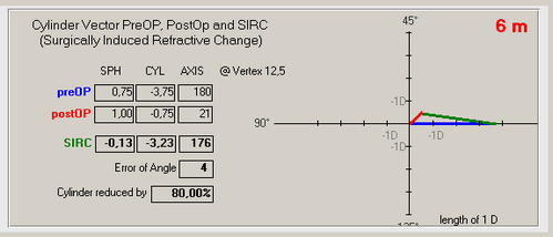
Datagraph-med uses vector analysis to calculate the surgically induced refractive change (SIRC) taking into account whether or not the clinder axis has changed. This is done for each follow up exam individually and can be seen on the astigmatism tab in the data entry form.
When plotting astigmatism graphs, the amount of achieved change in cylinder is using this vectorial change magnitude, taking axis changes into consideration.
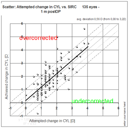
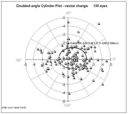
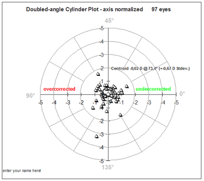
The above graph is a simplified view of the vectorial changes however and a second type of scatter graph which plots the change in magnitude and axis as polar plot is needed. The cylinder axis is doubled on this graph showing axis values of 0 and 180° in the same quadrant. The Centroid value shows the average magnitued and axis and the ellipse indicates one Stdev.
You may also plot the cylinder distribution (not the changes between pre and post OP) as 'double angle cylinder plot'...
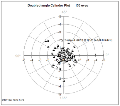
or 'normalized double angle cylinder plot' which may indicate any systematic induced axis change.
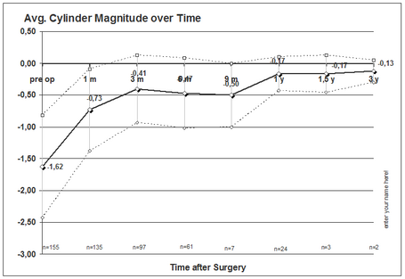
The graph 'avg. cylinder magnitude over time' plots the mean cylinder at each follow up interval including +- 1 Stdev. but ingores the vectorial (axis) changes. It simply shows the presence of cylinder but does not allow to differentiate between under or overcorrection.
More graphs on astigmatism outcomes will be added over time and analysis of the keratometic cylinder changes are shown in a similar way.